

The familiar blue and white color combination of Dropbox has now been redesigned by the company. The design change comes after 10 years of the same blue and white design. The new design incorporates a flat logo, which transforms into different surface planes, or the abstract representation of a box.
Hip design to attract users
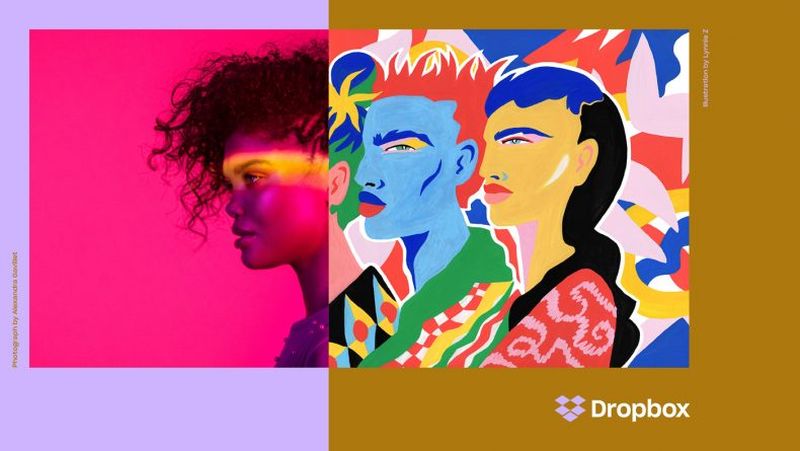
Image Source : cdn.techjuice.pk
Dropbox established itself with its blue and white trademark design, but probably to redesign comes with the wish to become more attractive to new users who are used to more color and complicated designs. The design is a big contrast to its biggest rivals in file sharing, such as Google Drive, Box, iCloud etc, who have a touch of blue in the logos.
In a recent interview, Dropbox revealed that the refreshing new colors would make it stand out among its rivals, as well as give a creative option to their users. According to company representatives, the colors of the logo can change based on certain situations, though the use of this feature is a little unclear right now. Maybe what it means is that you can save your files in different colors.
New Typeface
To stand out from the competition, Dropbox has made every possible effort. The update of Dropbox also includes a smart, new typeface called the Sharp Grotesk. Typeface is an important element of rebranding, and probably the typeface was changed to keep with the times and stay current.
Bold move
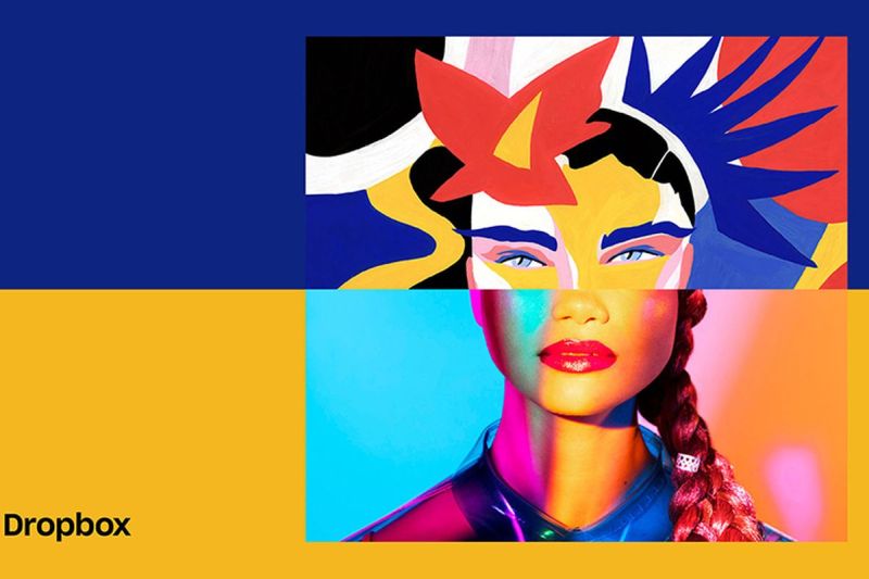
Image Source : dn.vox-cdn.com
Coming after ten years, the design revamp is a bold move, but perhaps much required, to inject some life into it. The logo might be new, but most of the app user interface as well as web interface are still quite similar. These are still white with grey and blue accents. It seems that the new colors and logo will be used more for marketing campaigns rather than interface changes.
The company made a statement, that it will be rolling out marketing and ad campaigns in a highly strategic manner. This will be done to attract the attention of creative people, and the ads will be placed in neighbourhoods and cities, where they tend to work and live. So if you’re a creative person living in a trendy city, don’t be surprised to see the new logo of Dropbox in newspapers and magazine or even online ads.
The new hip design of Dropbox is geared to make a mark and catch the attention of users, old and new, and make its competitors sit up and take notice.